
Office colours have an impact on employees’ moods and productivity. The correct colour scheme can help workers feel more comfortable, concentrated, and creative. Moreover, they can also help in giving guests a favourable first impression of the company. Not only do colour choices convey style, but they also reflect the company's values and brand.
The Science of Office Colour Psychology
The way people feel and behave at work can be affected by the surrounding colour. For example, research shows that the colour blue can increase performance by as much as 10% because it facilitates better concentration.
People who are exposed to bright colours such as red and yellow are highly stimulated and feel more alert or excited.
On the other hand, cool shades like blue and green are low stimulation and promote concentration and calmness. Careful planning around the office interior design cost is needed to ensure the design is both effective and budget-friendly.
Aligning Office Colours with Brand Identity
Use colour to communicate your company's values. Your office’s colour combinations should be consistent with the personality of your brand.
Bright colours, such as orange or yellow, might be used by a lively and imaginative business. To show stability and trust, a serious and professional business may decide to use grey or blue.
For example, to convey creativity, fun, and innovation, Google uses a lot of vibrant colours in its offices. On the other hand, IBM represents professionalism, strength and trust by using more subdued and sad shades like grey and blue.
A commercial interior design consultant can play a key role in making these colour choices effective for you, which can make your employees feel more comfortable, concentrated and creative
1. Desks
Workstations require focus and serenity. Here, cool hues like green and blue work best.
2. Meeting rooms
These spaces are meant for conversation and relaxation. Colours that are warm and inviting should be used that promote social interaction, such as soft coral, light green or yellow.
3. Reception areas
The first thing guests see is the reception. Select shades that are consistent with your brand and create a positive impression.
4. Creativity zones
Use vivid eye-catching hues such as orange, turquoise or even purple to stimulate creativity and generate fresh concepts.
Industry-Specific Colour Combinations
Office atmosphere changes by industry. A commercial interior design consultant can help identify the most effective palettes tailored to a business’s specific needs.
1. Tech Startups and Companies
- Startups and tech companies want to be innovative, creative and energetic.
- The best colours for tech startups are orange, white, and blue because these colours bring good and positive energy, build concentration and trust.
2. Offices of law firms and finance
- Law and finance firms must show professionalism, dependability and trust.
- The best hues are deep green, grey and navy because these shades have a reliable and businesslike atmosphere.
- When planning such spaces, it's important to consider the office interior design cost.
3. Clinics and wellness centres for healthcare
- Healthcare environments should be quiet, hygienic and compassionate.
- Patients feel more comfortable and secure if pastel hues are used, particularly light greens, gentle blues and white.
Top 7 Modern Office Colour Combinations (With Examples & Photos)
We have listed seven modern office colour combinations to enhance your workspace below:-
1. Blue + Grey + White – “The Productivity Combo”

A blend of blue, grey, and white builds focus and calmness. Blue enhances concentration, grey adds sophistication, and white keeps the space open and bright.
2. Sage Green + Cream – “Eco-Calm Studio”

Sage green paired with cream creates a serene and natural ambience. This combination brings a touch of nature indoors, promoting relaxation and well-being.
3. Teal + Mustard – “The Creative Spark”
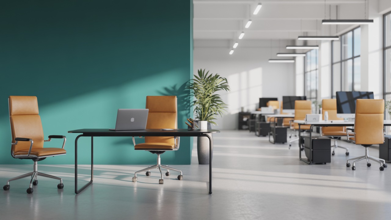
Teal and mustard together radiate positive energy and creativity into the workspace. Teal offers a refreshing vibe, while mustard adds warmth and vibrancy.
4. Coral + Peach + Muted Gold – “Sunset Glow”
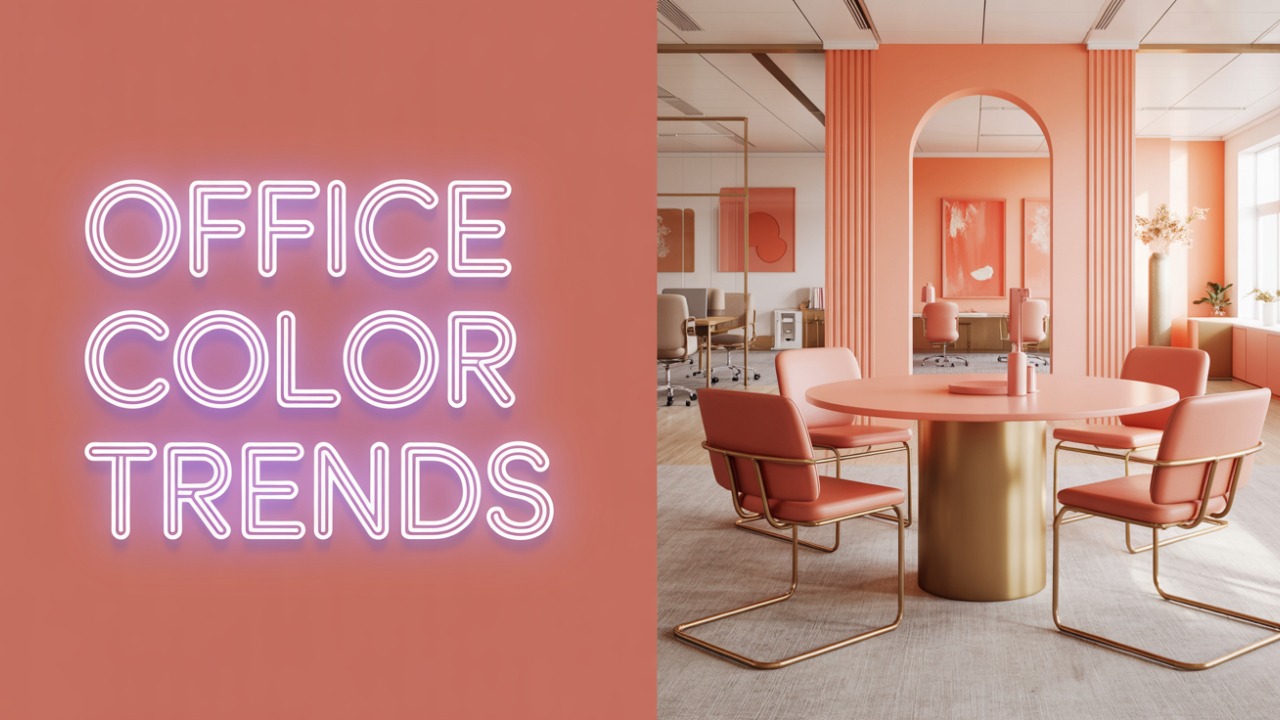
Inspired by sunset hues, this palette combines coral, peach, and muted gold to create a warm and inviting atmosphere, perfect for collaborative areas.
5. Black + White + Greenery – “Modern Zen”

A classic black and white scheme enhanced with touches of greenery offers a sleek, balanced, and tranquil environment, ideal for modern offices
6. Charcoal Grey + Steel Grey + Copper – “Urban Edge”

Combining shades of grey with copper accents delivers an industrial yet sophisticated look, adding depth and character to the workspace.
7. Soft Pink + Mint Green + Muted Gold – “Pastel Luxe”

Soft pink and mint green paired with muted gold create a gentle, calming, and luxurious feel, suitable for spaces aiming for a chic and contemporary aesthetic.
Common Mistakes to Avoid in Office Colour Planning
- Using too many bold or bright colours can overwhelm the space and reduce focus.
- Ignoring the influence of natural lighting can lead to colours looking dull or overly intense.
- Choosing colours based only on digital swatches without testing them on-site.
- Forgetting to consider the psychological impact of colours on productivity and mood.
- Overusing trendy colours that may not suit long-term office needs.
- Not coordinating colour schemes with office furniture and decor.
- Applying the same colour across all spaces without functional consideration.
How Lighting Affects Colour Perception in Offices
The colours' appearance in an office is greatly influenced by lighting.
1. Artificial light can change the appearance of colours.
Warm lights can make cool tones appear yellowish
While cool lights can make warm tones appear dull.
Natural light makes colours seem more vibrant and true.
Select the appropriate colours by testing paint samples at various times of the day in your office with real lighting.
DIY vs Hiring an Expert: When to Get Help
Small businesses can handle office colour planning themselves if the space is small, the design is simple, and they have a clear idea of what they want. However, for larger offices, open-plan areas or situations where a professional appearance is required, it is a good idea to hire a commercial interior design consultant. Experts help choose colours that boost productivity and match lighting and furniture. The cost depends on the size of the project and the firm you choose.
Conclusion
The colours that are chosen for the office can have a significant impact on how employees feel and perform. Every colour affects mood and energy differently, from bright oranges for creativity to serene blues for concentration.
When planning these design elements, it's important to also consider the office interior design cost, as it can vary depending on materials, finishes, and the scale of customisation.
At Serein Spaces, your trusted commercial interior design consultant, we help you in creating aesthetically pleasing and useful work environments that represent your company and build success.
FAQs
1. What are the best office wall colour combinations for small spaces?
Light colours that make small offices appear larger and brighter include white, beige, light grey and soft blue. To create interest without making the room feel crowded, combine them with one striking accent wall.
2. How does colour psychology improve team productivity?
Green provides calming energy, yellow stimulates creativity, and blue improves focus. Teams that use the appropriate colours are more motivated, less stressed and collaborate more effectively throughout the day.
3. Which office paint colours reduce stress and fatigue?
Earthy tones like taupe or beige, soft greens and light blues all help in mental and physical relaxation.
4. How to balance vibrant colours with corporate professionalism?
Use vibrant colours like yellow, red, or teal as accents on one wall, furniture, or artwork. Keep the main walls neutral to stay professional while still adding energy and personality to the workspace.
5.Yes, incorporating brand colours into office design contributes to a powerful identity.
